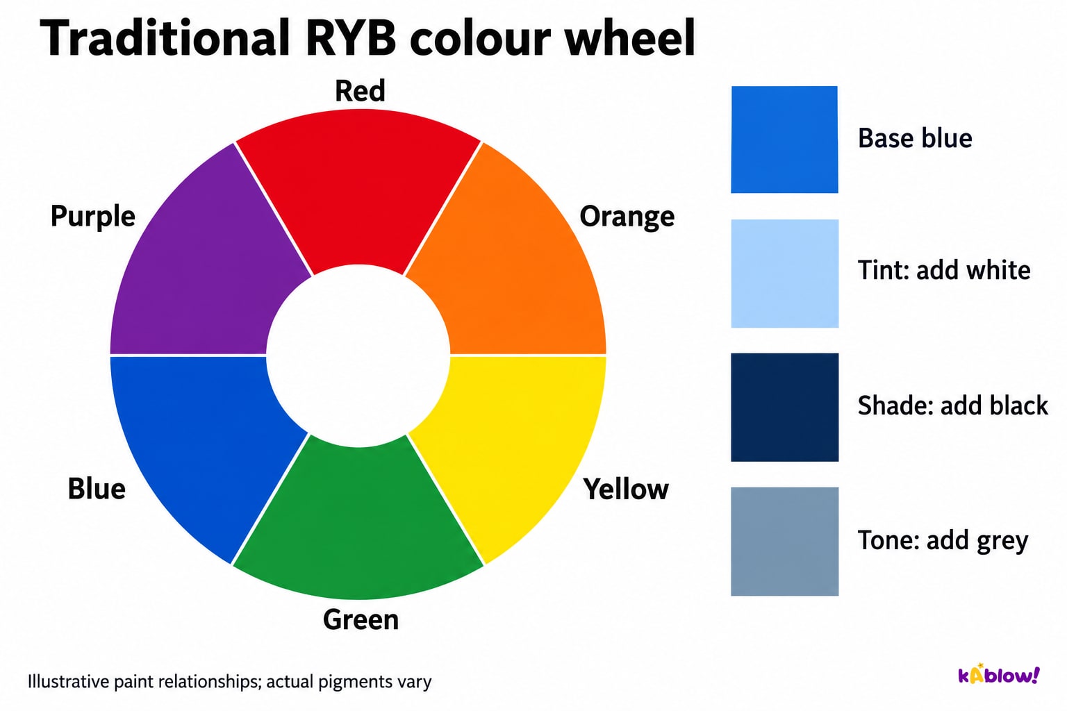
The traditional RYB art model uses red, yellow and blue as primaries, orange/green/purple as secondaries, and intermediate hues such as red-orange from neighbouring categories. It organises relationships rather than guaranteeing exact mixtures.
Actual pigment properties and proportions affect paint. RGB coloured light and CMYK printing use different starting sets. Do not apply paint-model primaries universally to screens or lights.
Traditional RYB relationships and blue mixtures
Schemes and relationships
Complementary hues occupy opposite positions on the selected wheel: red/green, blue/orange and yellow/purple in traditional RYB. Analogous hues are neighbours; monochromatic schemes vary one hue through value and saturation changes.
Juxtaposed complementary hues can contrast; physical pigment mixtures often become more muted. Hue contrast is different from light–dark contrast. Proportion, value and saturation also affect the result.
Distinguish three schemes
Tint, shade, tone and colour attributes
Hue is the colour family, value its lightness/darkness and saturation its vividness. A tinted or muted blue can remain blue; hue does not mean only pure, maximally vivid colour.
In the mixing convention taught here, adding white makes a tint, black a shade and grey a tone. Tone can also refer to relative lightness/darkness elsewhere in art. An added pigment can change several attributes at once.
Read the colour attribute
Colour and contextual meaning
Interpret colour through the specific work: marks, subject, setting and intention can support a reading of calm or urgency. The colour alone does not prove a maker’s emotional state.
Associations vary with historical setting, culture and individual experience. Avoid assigning one fixed meaning to all viewers or a whole culture. A red mark can play different roles in different works.
Interpret the stated context
Mixing and recording paint tests
Choose actual pigments and make small comparison swatches, recording materials and approximate proportions. Add strong dark paint gradually; review the dry result where relevant. A screen illustration is not a measured pigment sample.
A limited palette can help control relationships but does not guarantee success. Complementary pigments can neutralise or mute; they may also alter hue and value. In transparent watercolour, allowing white paper through a diluted wash can lighten appearance without adding opaque white paint.
Record a useful paint test
Temperature and suggested space
Warm red/orange/yellow and cool blue/green/purple are traditional groupings; a hue can be relatively warmer or cooler within its own family. These terms do not measure physical heat.
Warm colours may appear to advance in some pictorial relationships, but context matters. Lower distant contrast and saturation can suggest atmospheric depth; cooler or paler distant hues suit some scenes, not every landscape.
Qualify spatial colour conventions
Plan an intentional colour scheme
A monochromatic scheme varies one hue; analogous neighbours and complementary opposites offer other relationships. Every scheme still permits decisions about amount, position, value and saturation.
Compare alternatives against the intended effect and record reasons. Do not assume complementary means greatest value contrast or analogous means automatically calm and harmonious.
スライド
Sign up free to view the lesson slides
Step through every slide for this topic — plus flashcards and revision notes — with a free account.