Statistical Diagrams
Belajar sambil bermain
Jawab soal-soal ini untuk dapat energi, lalu memancing dan menjelajah. Tanpa akun.
Catatan pelajaran
Stem & Leaf Diagrams
- A stem-and-leaf diagram displays an ordered list of data using digits; two-digit numbers split into tens (stem) and units (leaf).
- The stem is written vertically, leaves horizontally in order; include a key showing how values are formed (e.g., 1|8 means 18).
- To find the median, cross out numbers from both ends until the middle is reached; remember to include the stem (e.g., median = 26, not 6).
- The range is the difference between the highest and lowest values; the highest is at the end of the last stem.
Tally Charts & Frequency Tables
- A tally chart uses vertical lines to count data; the fifth line is drawn diagonally across the previous four (e.g., ||||).
- Convert tally marks to a frequency table by counting totals (e.g., |||| || = 5+2 = 7).
- Frequency tables show how many times each item appears; they can be used to find the mode (most frequent item).
Bar Charts & Pictograms
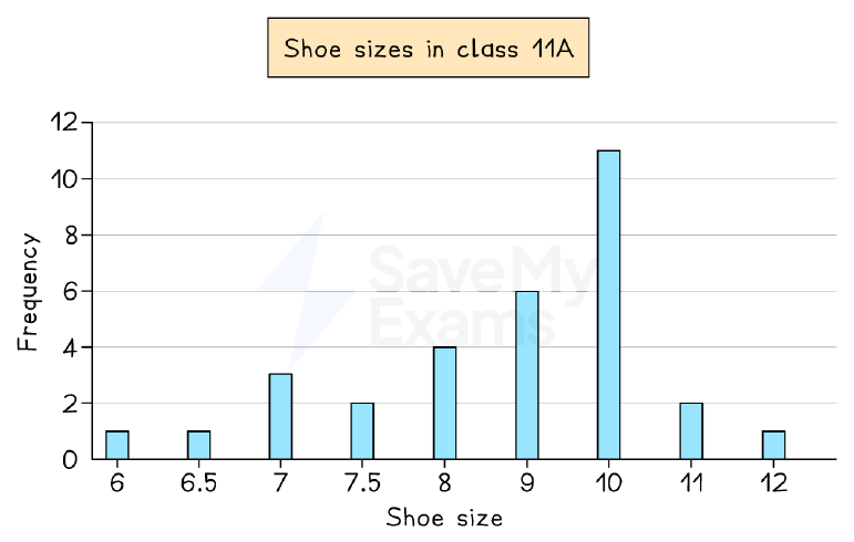
- A bar chart displays discrete data with bars of equal width separated by gaps; the vertical axis shows frequency, horizontal axis shows categories.
- The mode is the category with the highest bar; for grouped data, the median can be found by converting to a table and using cumulative frequency.
- A pictogram uses symbols to represent frequency; a key shows the value of one symbol (e.g., one shoe = 2 students).
- Half or quarter symbols can represent fractions of the key value; pictograms have no axes.
Bar chart: shoe sizes in class 11A
Pie Charts
- A pie chart is a circle divided into sectors showing relative proportions; each sector angle is (frequency/total) × 360°.
- To draw, calculate each sector angle, draw a vertical radius, then use a protractor to mark angles in order.
- If a pie chart says 'not to scale', use ratio and proportion (e.g., 30° = 15 people → 1° = 0.5 people).
- The total angle is 360°, representing the total frequency; angles are proportional to frequencies.
Pie chart: favourite colours (30 students)
Reading & Interpreting Statistical Diagrams
- Read titles, axis labels, and keys carefully; note units (e.g., thousands) and any extreme values (outliers).
- Describe trends using numbers from the graph (e.g., 'temperature decreased from 12°C to 9°C over 3 days').
- Be cautious about drawing conclusions: data may be unrepresentative (e.g., only one week) or biased.
- Use mode, median, mean, or range to support explanations; write in full sentences copying exact wording.
Garden temperature at 7am each day
Comparing Statistical Diagrams
- Compare trends (increases, decreases, peaks) and spread using range; use numbers from both data sets.
- Calculate averages (mean, median, mode) to compare central tendency; relate calculations to context.
- Comment on similarities and differences; note any outliers or unusual patterns.
- State limitations: data may be from a specific period (e.g., opening week) and not representative of normal patterns.
Comparing books bought by male and female customers
Slide
Sign up free to view the lesson slides
Step through every slide for this topic — plus flashcards and revision notes — with a free account.
Soal latihan
Pratinjau gratis — 8 dari 39 soal. Daftar untuk melihat semuanya.
1.In a stem-and-leaf diagram, what does the key '3|5' mean?
Easy- A35
- B3.5
- C53
- D305
2.What is the mode of the data set: 2, 3, 3, 5, 7, 7, 7, 8?
Easy- A3
- B5
- C7
- D8
3.A pictogram uses one symbol to represent 4 cars. How many symbols are needed to show 20 cars?
Easy- A4
- B5
- C16
- D80
4.In a bar chart, the height of a bar shows the
Easy- Afrequency
- Bcategory
- Ctotal
- Drange
5.What is the total angle in a pie chart?
Easy- A180°
- B270°
- C360°
- D90°
6.A pie chart has a sector of 90° representing 30 people. How many people does the whole pie chart represent?
Medium- A90
- B120
- C30
- D360
7.In a frequency table, the tally marks '|||| |||' represent what frequency?
Medium- A7
- B8
- C9
- D5
8.The number of cars in a car park each day: 124, 130, 129, 116, 132, 120, 127, 107, 118, 114. What is the range?
Medium- A25
- B23
- C24
- D26
Unlock all 39 questions, flashcards & more
Buat akun gratis untuk melihat setiap soal, slide, kartu flash, dan catatan ulasan topik ini.