Statistical Diagrams
边玩边学
回答这些题目来赚取能量,然后钓鱼探索。无需账号。
课程笔记
Stem & Leaf Diagrams
- A stem-and-leaf diagram displays an ordered list of data using digits; two-digit numbers split into tens (stem) and units (leaf).
- Stem written vertically, leaves written horizontally in order; include a key showing how values are formed (e.g., 1|8 means 18).
- To find the median, cross out numbers from ends until middle is reached; if two remain, find midpoint.
- Common mistake: writing only the leaf (e.g., 6) instead of stem+leaf (e.g., 26) for median.
Bar Charts & Pictograms
- A bar chart displays discrete data with bars of equal width separated by gaps; height shows frequency.
- The mode is the outcome with the highest bar; dual bar charts compare two data sets side-by-side.
- A pictogram uses symbols to represent frequency; a key shows value of one symbol (e.g., 1 shoe = 2 students).
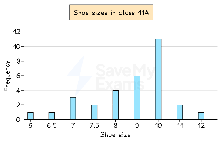
- Half or quarter symbols are used; to find median from bar chart, convert to table and use averages from tables method.
Bar chart: shoe sizes in class 11A
Pie Charts
- A pie chart is a circle divided into sectors showing relative proportions; angles are proportional to frequencies.
- To draw: find total frequency, calculate each sector angle as (frequency/total) × 360°, then draw using protractor.
- If chart says 'not to scale', use ratio/proportion; e.g., if 30° = 15 people, then 1° = 0.5 people.
- Total frequency corresponds to 360°; sector angle = (category frequency / total frequency) × 360°.
Pie chart: favourite colours (30 students)
Reading & Interpreting Statistical Diagrams
- Read context, keys, axis labels, and units carefully; note any outliers or anomalies.
- Describe trends using numbers from graph (e.g., 'temperature decreased from 12°C to 9°C').
- Use exact wording from question; calculate mode, median, mean, or range to support explanations.
- Consider limitations: small data set, bias, or scope (e.g., Jan-Mar data cannot predict August).
Garden temperature at 7am each day
Comparing Statistical Diagrams
- Compare trends (increases, decreases, peaks), steepness, and differences/similarities using numbers.
- Calculate mean or median to compare averages; calculate range to compare spread.
- Always relate calculations back to context; e.g., 'male range = 5, female range = 4, so males vary more'.
- Be cautious: data may be unrepresentative (e.g., opening week of a shop) – state reasons.
Comparing books bought by male and female customers
幻灯片
练习题
免费预览——40 题中的 8 题。注册即可查看全部。
1.In a stem-and-leaf diagram, the number 47 is represented as 4 | 7. What does the '4' represent?
Easy- AThe tens digit
- BThe units digit
- CThe value 4
- DThe key
2.In a stem-and-leaf diagram, what is the purpose of the key?
Easy- ATo show how to read the stem and leaves
- BTo unlock the diagram
- CTo indicate the total frequency
- DTo label the axes
3.A bar chart shows the favourite colours of students. The bar for 'Blue' is the tallest. Which average can be identified from this?
Easy- AMode
- BMedian
- CMean
- DRange
4.In a pictogram, one symbol represents 4 people. How many symbols are needed to represent 10 people?
Easy- A2.5
- B2
- C3
- D2.5 symbols
5.A pie chart shows the favourite sports of 40 students. The sector for football has an angle of 90°. How many students chose football?
Easy- A10
- B20
- C15
- D12
6.The stem-and-leaf diagram shows blood pressure reductions (mmHg) for 11 patients. Key: 1|2 means 12 mmHg. Stem: 1 | 2 6 7 8 9, 2 | 1 3 4, 3 | 1 4, 4 | 0. What is the median reduction?
Medium- A21
- B22
- C23
- D24
7.A dual bar chart compares the number of pets owned by Year 7 and Year 8 students. The Year 7 bar for 1 pet has height 10, and the Year 8 bar has height 8. How many more Year 7 students have 1 pet than Year 8?
Easy- A2
- B18
- C10
- D8
8.In a pie chart, the sector angle for a category is 72°. The total frequency is 60. What is the frequency of that category?
Easy- A12
- B15
- C20
- D10