Statistical Diagrams
邊玩邊學
回答這些題目賺取能量,接著就能釣魚、探索。不需要帳號。
給教育者: 為 Statistical Diagrams(Maths [CIE]、Core)準備好可直接使用的課程投影片, 複習筆記——用於你的課程,或把這個主題當成互動班級活動,讓學習者以即時遊戲的方式進行。
課程筆記
Stem & Leaf Diagrams
- A stem-and-leaf diagram displays an ordered list of data using digits; two-digit numbers split into tens (stem) and units (leaf).
- The stem is written vertically, leaves horizontally in order; include a key showing how values are formed (e.g., 1|8 means 18).
- To find the median, cross out numbers from both ends until the middle is reached; remember to include the stem (e.g., median = 26, not 6).
- The range is the difference between the highest and lowest values; the highest is at the end of the last stem.
Tally Charts & Frequency Tables
- A tally chart uses vertical lines to count data; the fifth line is drawn diagonally across the previous four (e.g., ||||).
- Convert tally marks to a frequency table by counting totals (e.g., |||| || = 5+2 = 7).
- Frequency tables show how many times each item appears; they can be used to find the mode (most frequent item).
Bar Charts & Pictograms
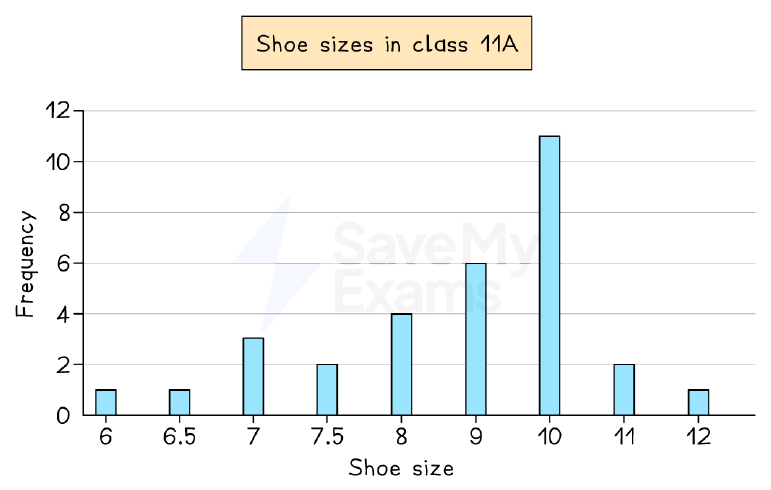
- A bar chart displays discrete data with bars of equal width separated by gaps; the vertical axis shows frequency, horizontal axis shows categories.
- The mode is the category with the highest bar; for grouped data, the median can be found by converting to a table and using cumulative frequency.
- A pictogram uses symbols to represent frequency; a key shows the value of one symbol (e.g., one shoe = 2 students).
- Half or quarter symbols can represent fractions of the key value; pictograms have no axes.
Bar chart: shoe sizes in class 11A
Pie Charts
- A pie chart is a circle divided into sectors showing relative proportions; each sector angle is (frequency/total) × 360°.
- To draw, calculate each sector angle, draw a vertical radius, then use a protractor to mark angles in order.
- If a pie chart says 'not to scale', use ratio and proportion (e.g., 30° = 15 people → 1° = 0.5 people).
- The total angle is 360°, representing the total frequency; angles are proportional to frequencies.
Pie chart: favourite colours (30 students)
Reading & Interpreting Statistical Diagrams
- Read titles, axis labels, and keys carefully; note units (e.g., thousands) and any extreme values (outliers).
- Describe trends using numbers from the graph (e.g., 'temperature decreased from 12°C to 9°C over 3 days').
- Be cautious about drawing conclusions: data may be unrepresentative (e.g., only one week) or biased.
- Use mode, median, mean, or range to support explanations; write in full sentences copying exact wording.
Garden temperature at 7am each day
Comparing Statistical Diagrams
- Compare trends (increases, decreases, peaks) and spread using range; use numbers from both data sets.
- Calculate averages (mean, median, mode) to compare central tendency; relate calculations to context.
- Comment on similarities and differences; note any outliers or unusual patterns.
- State limitations: data may be from a specific period (e.g., opening week) and not representative of normal patterns.
Comparing books bought by male and female customers
投影片
練習題
免費預覽——39 題中的 8 題。註冊即可查看全部。
1.In a stem-and-leaf diagram, what does the key '3|5' mean?
Easy- A35
- B3.5
- C53
- D305
2.What is the mode of the data set: 2, 3, 3, 5, 7, 7, 7, 8?
Easy- A3
- B5
- C7
- D8
3.A pictogram uses one symbol to represent 4 cars. How many symbols are needed to show 20 cars?
Easy- A4
- B5
- C16
- D80
4.In a bar chart, the height of a bar shows the
Easy- Afrequency
- Bcategory
- Ctotal
- Drange
5.What is the total angle in a pie chart?
Easy- A180°
- B270°
- C360°
- D90°
6.A pie chart has a sector of 90° representing 30 people. How many people does the whole pie chart represent?
Medium- A90
- B120
- C30
- D360
7.In a frequency table, the tally marks '|||| |||' represent what frequency?
Medium- A7
- B8
- C9
- D5
8.The number of cars in a car park each day: 124, 130, 129, 116, 132, 120, 127, 107, 118, 114. What is the range?
Medium- A25
- B23
- C24
- D26
歷屆試題
這個主題的歷屆試題練習即將推出。
即將推出